
10 Capstone
Reading Objectives
-
Study Design and Inference: Use the inference hierarchy to explain what DSARM analyses can and cannot claim, and apply responsible language that matches an observational design.
-
Confounding and Causal Pathways: Define confounding, apply the H1–H3 screening approach to evaluate a plausible third variable, and distinguish confounders from mediators.
-
Capstone Analysis Blueprint: Develop and carry out a defensible analysis plan using the DSARM wave structure (age 16 and age 21) and the course’s allowed tests, including basic validity checks and transparent reporting.
-
Poster Simulation and Dissemination: Translate results into the required poster simulation components, emphasizing figure-centered communication, clear captions, and conclusions that reflect uncertainty and inference limits.
Key Terms
-
Confounder (C): A third variable associated with both the IV and DV that can bias the observed IV–DV association if not accounted for.
-
Confounding bias: Distortion of an IV–DV association due to a confounder, making an effect look larger, smaller, or present when it is not.
-
Mediator: A variable on the causal pathway between IV and DV; controlling for a mediator can remove part of the mechanism linking IV to DV.
1. Introduction: Capstone Project Overview
Module 10 is the capstone for DSARM. The goal is to integrate what you have learned about study design, observational inference, confounding, basic hypothesis testing, and responsible communication into one coherent mini-project.
Your final deliverable is a poster simulation, meaning you will build the core components of a scientific poster as a slide deck (not a full conference poster). This format is intentional. It trains you to communicate one clear research story, supported by well-labeled figures and careful interpretation, while staying honest about what observational data can and cannot justify.
To complete the capstone, you will work with a synthetic ABCD-style dataset. You can access the dataset in the course GitHub repository. It is designed to feel like a real, large-scale longitudinal dataset while remaining safe for teaching. You will choose a research question, identify one main predictor (IV) and one main outcome (DV), include at least one plausible third variable to consider as an alternative explanation, and then use the course’s allowed tests to produce figures and results that you can explain clearly.
| DSARM synthetic dataset | Start with the data dictionary |
|---|---|
|
|
2. Study Design and Levels of Inference (Refresher → Inference Hierarchy)
Your conclusions can only be as strong as your design. This section offers a quick refresher on study design (introduced in Module 2) to orient you toward the inference hierarchy you will use to frame your data analyses.
2.A. Experimental vs. Observational Study Designs
-
Experimental design (best for causal claims). In an experimental study, researchers assign an exposure or intervention to participants, ideally using random assignment. Random assignment aims to make groups comparable at baseline, so any later differences in outcomes are less likely to be “false alarms” caused by pre-existing group differences. When an experiment is well-executed, outcome differences can be more credibly linked to the intervention itself.
-
Observational design (what ABCD and DSARM are). In an observational study, researchers measure what naturally happens without assigning exposure. This design can reveal real-world patterns and associations, but it is also vulnerable to alternative explanations. People who differ on the exposure often differ on other characteristics too, which can make an association look causal when it is actually driven by hidden baseline differences or “third-variable” influences. That is why observational findings require more cautious interpretation.
2.B. Within observational: Cross‑sectional vs. Longitudinal
- Cross-sectional studies (single wave). Cross-sectional designs measure exposure and outcome at the same time. They provide a snapshot of relationships in a population, but they generally cannot establish temporal order. If X and Y are measured simultaneously, it is hard to know whether X preceded Y, Y preceded X, or whether both reflect other background factors.
- Longitudinal studies (multiple waves). Longitudinal designs measure the same individuals repeatedly over time. This can strengthen inference because it helps establish temporal order (X measured before Y) and allows you to study change. Still, time ordering alone does not guarantee causation, because third-variable influences can still shape both the predictor and the outcome over time.
2.C. Design features that strengthen inference (the bridge to the hierarchy)
Certain design features move a study closer to causal inference:
-
Random assignment reduces systematic baseline differences between groups, which reduces bias from hidden group differences.
-
Natural and quasi-experiments exploit external events that create “as-if random” exposure. A classic example is Oregon’s Medicaid lottery, which allowed researchers to compare lottery-selected vs non-selected groups in a way that closely resembles random assignment.
-
Time ordering (longitudinal data) helps answer “what came first,” but it still does not remove all alternative explanations by itself.
-
Better comparisons and statistical adjustment (clear comparison groups, covariates, and sensitivity checks) can reduce bias from third-variable influences, but they cannot eliminate it completely.
2.D. Inference hierarchy (stronger → weaker for causal claims)
A common hierarchy for causal strength looks like this:
-
Randomized experiments (strongest for causal claims when conducted well).
-
Natural / quasi-experiments (can approach causal inference when “as-if random” assumptions are plausible).
-
Longitudinal observational studies (temporal order helps; causal insight is limited and depends on how well alternative explanations are addressed).
-
Cross-sectional observational studies (association only; direction unclear).
-
Case studies / descriptive reports (excellent for hypothesis generation, not for causal testing).
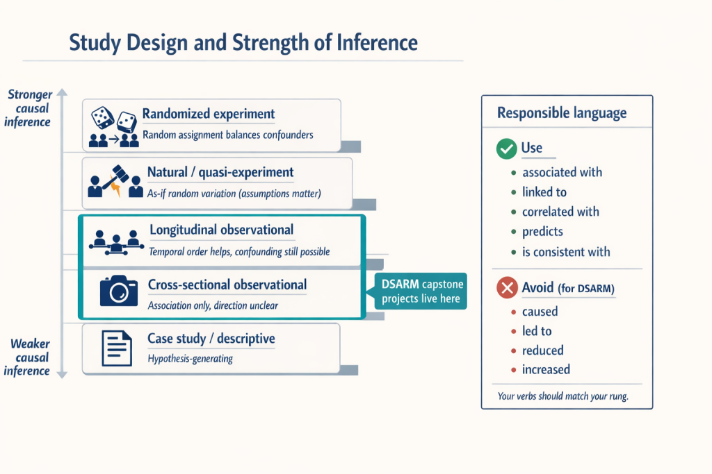
2.E. What this means for DSARM capstone projects
DSARM capstone projects will fall in #3 or #4. You can strengthen inference by:
-
using multiple waves when possible (so you can speak to temporal order),
-
defining clear comparison groups (more apples-to-apples),
-
reporting unadjusted vs adjusted models to show whether the association is robust to plausible alternative explanations. Comparing unadjusted and adjusted models allows you to see whether the observed association persists after accounting for plausible alternative explanations, which strengthens the credibility of your interpretation.
2.F. Responsible language (keep your claims inside your design)
Your interpretations should match your design:
-
Prefer: “is associated with,” “is linked to,” “correlates with,” “predicts,” “is consistent with.”
-
Avoid causal verbs like “causes,” “leads to,” “reduces,” or “increases” unless you truly have a randomized or strong quasi-experimental design.
Example contrast:
-
Appropriate: “Higher baseline screen time predicts lower attention at follow-up.”
-
Overreach: “Screen time reduced attention.”
3. Confounding: Identifying and Addressing Third Variables
3.A. Why confounding matters (one motivating example)
Imagine you find a strong pattern in ABCD: adolescents who report frequent energy drink use at Time 1 also report higher anxiety at Time 2. It is very tempting to tell a simple story, such as “energy drinks cause later anxiety.” The problem is that observational datasets are full of clustered life circumstances, so an apparent relationship can be a “false positive” for causation. Teens who drink a lot of energy drinks might also be sleeping less, under more academic pressure, experiencing higher baseline anxiety, living with more family stress, or embedded in peer contexts that increase both energy drink use and anxiety risk. In other words, the association may be real, but the causal explanation may be wrong. This is why observational findings can sound causal even when they are not.
3.B. Definition (what a confounder is and what it does)
A confounder is a third variable that is not the exposure and not the outcome, but is related to both in a way that biases the association we estimate. A useful way to think about it is “shared causes.” If the exposure and the outcome share a common cause, then part of the observed exposure–outcome relationship can reflect background risk differences rather than an effect of the exposure itself. This third-variable bias can make an association look larger than it really is, create an association that is mostly spurious, or even hide and reverse an association, depending on how the shared causes are distributed across the groups you are comparing.

This is one reason randomized experiments sit at the top of most inference hierarchies. Random assignment is designed to balance both known and unknown confounders across groups. Randomization makes it less likely that baseline differences (e.g., biases) explain outcome differences. In observational studies, like ABCD, you do not get that randomization, so you rely on measurement and adjustment. This entails identifying plausible third variables, measuring them well, and testing whether your main association changes when you account for them. Even then, observational work cannot guarantee that every relevant third variable has been measured, so responsible interpretation requires some humility.
3.C. Common ways researchers test and account for confounding
In observational research, you cannot rely on random assignment to balance background differences between groups, so you have to reduce bias through analysis choices. A common starting point is regression adjustment, where you include plausible confounders as covariates so the IV–DV association is estimated while holding those third variables constant. In its simplest form, this looks like a multiple regression model such as DV = β₀ + β₁(IV) + β₂(C) + … . The key diagnostic is what happens to the IV estimate (β₁) once the confounder enters the model. If β₁ shrinks substantially or becomes non-significant, the original association may have been largely explained by C. If β₁ stays similar, the association is more robust to that confounder, though it can still be vulnerable to unmeasured third variables.
To make this logic transparent, researchers typically use model comparison and report results from both an unadjusted and an adjusted model. Model A estimates DV ~ IV, which describes the raw association. Model B estimates DV ~ IV + C (and possibly additional confounders). You then compare the IV coefficient, uncertainty, and model N across Model A and Model B and describe how the interpretation changes.
Researchers also sometimes use stratification or matching to make comparisons more apples-to-apples. The idea is to compare high vs. low exposure groups within levels of the confounder, such as comparing high vs. low screen time among youth who have similar sleep duration. This approach can be useful for intuition and for simple visualizations. In this course, regression adjustment will usually be the primary tool.
Finally, when working with longitudinal data, many researchers use baseline outcome control as an additional guardrail. If you have a baseline measure of the DV, you can model the follow-up DV while controlling for the baseline DV, for example: Time 2 attention ~ Time 1 screen time + Time 1 attention + confounders. This reduces confounding from stable individual differences that influence the outcome and reframes the question as whether the IV predicts change or divergence over time. A short caution is worth remembering. Baseline control can over-control in cases where the IV already influenced the baseline DV, but in most observational follow-up analyses it is a strong default.
3.D. The “crude” H1–H3 approach
Before you use regression adjustment, it helps to build intuition for what a confounder looks like in the data. In the capstone, we use a deliberately “crude” screening approach that asks a simple question: does a third variable C show up in the story on both sides, meaning it is related to the predictor and the outcome? The goal here is not to prove causation or to claim you have identified the one true confounder. The goal is to develop a disciplined habit of checking whether your main IV–DV relationship could plausibly reflect shared background differences rather than a direct effect.
We do this using a small bundle of hypothesis tests (our H1–H3 framework in the capstone). First, you test H1, the primary association you actually care about, by estimating a simple unadjusted model such as DV ~ IV. Next, you test whether your candidate confounder is tied to the predictor by checking H2 (IV ~ C). Then you test whether the same candidate is tied to the outcome by checking H3 (DV ~ C). If both H2 and H3 are supported, C becomes a plausible confounder because it is associated with both sides of the relationship you are trying to interpret. At that point, your original H1 association may be partly or largely explained by C, even if H1 was statistically significant.
Once you have that basic intuition, you move from “screening” to “accounting.” You fit an adjusted model such as DV ~ IV + C (and possibly additional confounders) and compare the IV estimate in the adjusted model to the IV estimate in the unadjusted model. If the IV effect shrinks a lot, that suggests the unadjusted association was strongly sensitive to C. If it stays similar, the association is more robust to that particular alternative explanation. This simple workflow is not the final word on confounding, but it is a reliable first step that will keep your interpretations honest and your methods transparent.
3.E. Confounders vs. mediators (do not block the mechanism by accident)
Not every third variable belongs in your “control variables” list. Some variables are true confounders, meaning they sit outside the relationship you care about and create background differences that can bias the IV–DV association. Others are mediators, meaning they are part of the causal pathway through which the IV exerts its influence on the DV. The distinction matters because controlling for a mediator can accidentally remove the very process you are trying to understand.
A confounder is an outside cause that influences both the IV and the DV. If you do not account for it, you risk attributing an association to the IV when it may actually reflect shared background causes. In contrast, a mediator is a step in the chain from IV to DV. If your research question is about the total relationship between IV and DV, controlling for the mediator can “block” the pathway and make the IV look less important than it truly is.

Here is a quick example. Suppose your IV is peer substance use and your DV is your own substance use. A plausible mediator is your attitudes toward drugs. Peers can shape attitudes, and attitudes can shape behavior. If you control for attitudes in a model, you may be removing part of the mechanism by which peers influence use. That is not wrong in every situation, but it changes the question you are answering. Instead of estimating the total association between peers and your own use, you are estimating what is left after stripping out the attitude pathway.
4. Capstone Analysis Blueprint (From Research Question to Results)
The capstone deliverable of this course is a poster simulation slide deck that contains the core poster components. This Section 4 focuses on producing the results that will populate those slides. Because our synthetic ABCD dataset is observational, your main job is to (1) make your analysis plan explicit before you run models, (2) run a small set of primary tests that match your design, and (3) communicate what your results do and do not justify.
4.A. Define the research question and variables (operationalize early)
Start by writing your research question in one sentence in a way that can be answered with DSARM variables. Because DSARM includes Time 1 (age 16) and Time 2 (age 21), you can frame questions that use one wave or both waves, and you can treat the five-year span as meaningful when it fits your topic.
Here are flexible one-sentence templates you can use:
- Cross-sectional (single wave): “At age 16 (Time 1), is X associated with Y?” or “At age 21 (Time 2), is X associated with Y?”
- Prospective prediction (two waves): “Does X at age 16 (Time 1) predict Y at age 21 (Time 2)?”
- Change over time (two waves): “Does X at age 16 (Time 1) predict change in Y from age 16 to age 21?”
- Co-change (requires X and Y at both waves): “Do changes in X from age 16 to 21 track with changes in Y over the same period?”
- Group differences in change: “Do groups defined at Time 1 (for example high vs low X) differ in how much Y changes from 16 to 21?”
Once you have the question, convert it into concrete analytic ingredients:
- Identify your IV (predictor/exposure) and DV (outcome).
- List your planned covariates, especially variables you will adjust for as alternative explanations.
- Confirm how each variable is measured (continuous, binary, ordinal, categorical).
- Write down exactly which wave each variable comes from: Time 1 (age 16) and/or Time 2 (age 21).
- Decide whether you need derived variables (sum scores, composites, or change scores like Time 2 minus Time 1), and write down the exact recipe.
A practical rule: if you cannot state exactly how the DV is measured and which wave it comes from, you do not yet have an analysis plan.
4.B. Choose design and timeframe (match the question)
Now that you have defined your IV, DV, covariates, and wave(s), choose a design that matches that question and record the inference limits that come with it. DSARM and ABCD are observational datasets. Exposures are measured rather than assigned, so your conclusions should be framed as associations or predictions, not causal effects.
Your main design choice is straightforward:
- Cross-sectional means you are analyzing a single wave (Time 1 at age 16, or Time 2 at age 21). This supports clear descriptive and associative claims at that age, but it does not establish direction.
- Longitudinal (two-wave) means you are using both waves across the five-year span. This supports statements about temporal ordering, such as whether Time 1 predicts Time 2, but it still does not prove causation.
Concrete decisions to record up front:
- Is this cross-sectional (single wave) or two-wave longitudinal (Time 1 → Time 2)?
- If two-wave longitudinal, what is the exact ordering (for example, Time 1 predictor → Time 2 outcome)?
- Will you include baseline outcome control when available (for example, modeling the Time 2 outcome while controlling the Time 1 level of the same outcome)? If yes, state why, since it changes the interpretation toward change over time rather than simple prediction.
4.C. Build a reproducible project plan before running models
In research, “reproducible” means a reader can trace every statistic and finding in your results back to a saved output that was generated by code. This is not busywork. It is how you prevent results from drifting as you revise notebooks, rerun cells, or update plots. Equally important, this is how other researchers verify your findings.
Set up the structure before you analyze:
- Create a clear folder structure (for example:
data_raw/,data_clean/,scripts/,outputs/,figures/,poster/). - Use consistent filenames that record wave(s), variable set, and version/date (for example:
t1_age16_screen_attention_v1.csv). - Keep an analysis log (a short markdown file is fine) that records:
- variables and waves used (and why),
- cleaning rules and exclusions,
- derived-variable recipes,
- model formulas you ran,
- final analytic N for each model.
- Use a “no handcrafted figures” rule. Every plot should be generated from code and saved with a stable filename.
4.D. Execute the analysis sequence (what you actually run)
This is the core workflow. It is intentionally simple so you can do it well and explain it clearly.
1) Data audit and cleaning plan
Confirm coding, missingness rules, and exclusions. Track sample size changes as you clean, because changing N changes interpretation.
2) Descriptives and visuals
Summarize distributions for IV, DV, and key covariates. Make at least one plot matched to the question type (scatterplot, boxplot, bar chart with uncertainty). The plot should reflect your design choice, meaning it should clearly indicate whether you are describing a single-wave association or a Time 1 to Time 2 relationship.
3) Primary model (H1)
Fit the unadjusted association: DV ~ IV. Save the estimate, uncertainty (CI if available), p-value if used, and model N.
4) Confounding checks and adjusted model
Fit the adjusted model: DV ~ IV + confounders (and baseline DV if longitudinal). Compare unadjusted vs adjusted IV estimates and describe what changed.
5) Sensitivity / robustness (optional, lightweight)
Run one extra check only, such as an alternative operationalization or one additional covariate set. Label anything beyond the primary plan as exploratory.
4.E. Assumptions and validity checks (for t-tests, ANOVA, and correlations)
Every statistical test makes assumptions. You do not need perfection, but you do need to know when a result might be fragile. In this capstone, your checks should match the tests you actually use, which are group comparisons (t-tests/ANOVA) and simple associations (correlations).
Minimal checks to include:
-
Outliers: check for extreme values that could drive group differences or correlations.
-
Distribution shape: use a histogram or boxplot to see skew and heavy tails (especially for small samples).
-
Equal variances (for group comparisons): compare group spreads; if variances differ, use Welch’s t-test when applicable.
-
Group sizes: note when one group is much smaller than another, since this can affect stability and interpretation.
-
Independence: note clustering (site, school, family) as a limitation if relevant.
-
For correlations: inspect a scatterplot to ensure the relationship is not being driven by a single outlier or a weird nonlinear pattern.
If a check raises concerns, document what you did:
-
use a more robust option (for example, Welch’s t-test),
-
rerun after a clearly justified recode or exclusion rule (with transparency),
-
or keep the analysis but interpret cautiously and say why.
4.F. Multiple testing and transparency rules (so results mean something)
When you run many tests, the chance of a false positive increases. This is basic probability, not a character flaw. The fix is to keep your primary analysis tight, label exploratory work honestly, and use a correction when you are doing many related comparisons.
Guardrails to build into your plan:
- Pre-limit your primary test set (one primary DV or one primary model).
- Label analyses as confirmatory (planned) versus exploratory (hypothesis-generating).
- If you run many related tests, use a correction strategy and name it:
- Bonferroni (strict), or
- False Discovery Rate (FDR) control (common in multi-test settings). (Wiley Online Library)
A simple reporting norm is to put the correction rule in Methods and keep the interpretation conservative, especially for exploratory results.
4.G. Interpretation guardrails (ethics + uncertainty)
Your interpretation should match your design, your analytic choices, and your uncertainty. Start by reporting what you actually analyzed. State the final analytic sample size used in each key test and explain why it changed, because missing data, exclusions, and recoding decisions are part of the meaning of the study, not just technical details.
- Statistical uncertainty:
- Emphasize effect sizes and the stability of the pattern shown in the figure.
- Do not treat a single p-value threshold as a truth machine.
- If available, report uncertainty information such as confidence intervals or standard errors.
- Do not let uncertainty metrics replace substantive interpretation of the effect.
- Causal uncertainty:
- Because the dataset is observational, associations may reflect alternative explanations.
- Keep verbs aligned to the inference hierarchy.
- “Associated with,” “differs from,” and “predicts” (when Time 1 precedes Time 2) are usually appropriate.
- Avoid using “causes” for analyses.
- Generalizability:
- Be explicit about what your findings do and do not generalize to.
- Note that the dataset is synthetic and context-specific.
- Acknowledge the wave structure spanning age 16 to age 21 when discussing scope and limits.
Finally, apply an ethical lens to interpretation. Avoid stigmatizing language when describing group differences, and focus on mechanisms, context, and uncertainty. A strong capstone conclusion reads as careful and credible because it is honest about limits, transparent about decisions, and disciplined about claims.
5. What a scientific poster is (and what it is not)
Section 5 shows how to turn the outputs from Section 4 into the required poster simulation components. A scientific poster is a conference communication format built for speed and interaction. In most poster sessions, people are moving, scanning, and deciding quickly what is worth a closer look. A good poster is designed to be readable at a glance and useful during conversation. It functions as a visual aid for the short spoken explanations you give when someone stops at your poster.
That is why posters exist alongside papers and talks. A paper is built for depth and permanence. It can include full methods, nuance, and detailed analysis, and readers engage with it over time. A talk is built for a guided story delivered to a captive audience in a fixed time slot. A poster sits in between. It is a “snapshot” of the work that helps you engage colleagues in dialogue, get feedback, and spark follow-up discussions. NIH’s guidance makes the same point operationally: you should be able to deliver a short verbal explanation of the work to people who “attend” your poster session.
Your poster should communicate one central claim that matches your inference level, supported by one to two figures that carry the evidence. Everything else is supporting material that helps a reader understand what you did and why it matters. If you try to fit three different research stories on one poster, you usually end up with a crowded wall of text that is hard to scan and even harder to discuss. The poster is not a full paper shrunk down. It is an intentionally distilled story that invites questions.

The DSARM Poster Simulation assignment (what you are building)
In this course, you are not creating a full conference poster. You are building the core elements of a scientific poster as a slide-based poster simulation. That is deliberate. It keeps the focus on the fundamentals of dissemination, meaning telling a clear research story with evidence, while avoiding the distractions of advanced poster software, print formatting, and layout micro-decisions.
Your slide deck maps directly onto standard poster sections:
- Title and Abstract: the top of the poster, which tells the reader what the project is and why it matters.
- Research Question and Hypotheses: the “what are we testing” section.
- Participants and Measures: the essential methods content needed to interpret the results.
- Results slides for H1, H2, H3: three result claims, each supported by one visualization and a short caption.
- Discussion and Conclusion: interpretation, limitations, and what the findings imply.
- Citations: credit and traceability.
- AI Use Attestation: a transparency statement about how you worked.
One benefit of this structure is that it trains you to separate roles: a slide is not a place to dump everything you did. Each slide has a job, and the whole deck functions like a poster session conversation.
5.A. Why posters matter for scientific research dissemination
Posters matter because they let researchers share new work quickly, visually, and at high volume in conference settings. They are designed for fast scanning plus conversation, so they help an audience grasp the research question, approach, and main result in a short amount of time.
Posters also function as a structured “argument test.” Space constraints force you to make choices explicit. You have to state the question clearly, define the variables, describe the design, and show the key evidence. That constraint is a feature.
Poster sessions are also a feedback engine. Researchers routinely use posters to get real-time critique that improves a project before it becomes a manuscript or a formal talk. In practice, the best poster conversations often revolve around measurement choices, alternative explanations, and what the findings do and do not justify. This is why posters are a staple in research training.
Finally, posters help bridge expert and non-expert audiences. A well-designed figure and a plain-language caption can communicate a finding more accessibly than a dense methods section. This matters for dissemination because research does not only live in journals. It also moves through labs, departments, conferences, and community-facing spaces, and posters are one of the most common formats for that movement.
5.B. Poster anatomy as a narrative arc
Scientific posters are structured stories, not templates. A template can help with layout, but it cannot tell you what the story is. The story is the sequence of ideas that a reader can follow in a single pass, even if they only give you 30 seconds. The poster format rewards clarity because it is designed for quick scanning and short conversations, not for long reading. A simple, reliable arc is: background → research question → methods → results → interpretation → limitations.
What people look for in 30 seconds is different from what they ask in conversation. In a fast scan, readers typically look for (1) the title, (2) the question, (3) one clear figure, and (4) a bottom-line statement. In conversation, they usually ask about design choices and credibility: why this question, what variables and waves, what you controlled for, how you handled alternative explanations, and what remains uncertain.
5.C. Figures and captions as the core of the poster
Figures are the heart of a poster because they communicate patterns faster than text. The best posters have one figure per claim, not many weak figures that compete for attention. If you have three claims, you should have three figures. That matches your H1, H2, H3 structure nicely.
Captions should be short and functional. A good caption answers three questions in one to two sentences: what is plotted, who is included, and which variables and waves are shown. Captions should not be mini-discussions. They should orient the reader so they can interpret the figure correctly.
For this assignment, do not report p-values in captions. Instead, focus on what the figure shows in plain language: direction, magnitude, uncertainty when available, and sample size. If you want to communicate statistical support, the caption can mention confidence intervals or describe the size of the estimated relationship, but keep it simple.
Basic readability norms matter more than students expect. Axes should be labeled clearly, units should be included when relevant, legends should be readable, and variable names should be consistent with the rest of the deck. If the reader cannot interpret the plot in five seconds, the plot is not doing its job.
5.D. Poster readiness: the 2-minute walkthrough
A poster simulation works best when you can explain it out loud in a tight, two-minute story. The simplest structure mirrors the deck: start with the question, summarize the design and measures, walk through the three results slides, then give a careful conclusion with limitations.
A practical pacing model:
- 20 seconds: background and research question
- 20 seconds: dataset and measures
- 60 seconds: results, one sentence per figure (H1, H2, H3)
- 20 seconds: conclusion and what remains uncertain
Prepare for three predictable questions.
“What did you find?”
Answer with one sentence that matches the inference tier, then point to the single most important figure.
“How did you test confounding?”
Answer by describing the unadjusted versus adjusted comparison. Mention which covariate(s) you used and what changed in the IV estimate.
“What is still uncertain?”
Name the biggest remaining alternative explanation, limitation, or generalizability constraint.
End with one reproducibility sentence you can say out loud, such as: “All figures and model outputs in this deck were generated from my analysis code, and the saved outputs and figure files are stored in my project folders so the results can be traced and reproduced.”
